Kon’nichiwa Tokyo!
After much waiting, delays and postponements, we can finally see the 2020 Tokyo Olympics in sight, one year later than planned but hopefully a global coming together that the world needs right now.
It is almost appropriate that ‘the land of the rising sun’ should be the place where the Olympic games return. While the riders battle it out in the shadows of Mount Fuji and through forests of giant evergreen trees we at moomoo wanted to ensure the riders of the Estonian National Team had something special and unique to wear. For that reason we started from scratch, cleared the page and made a brand new design, unique and for this event only
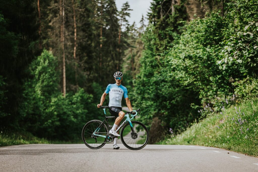
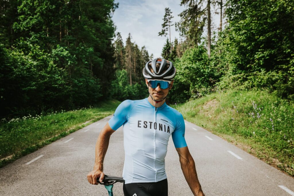
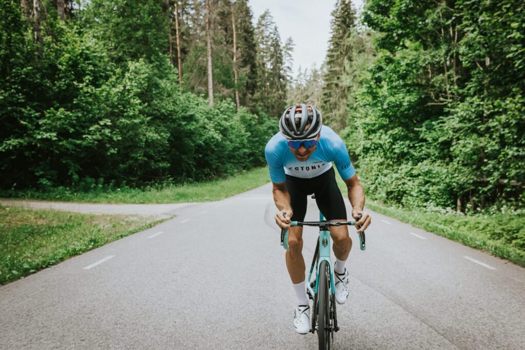
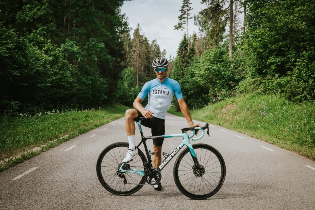
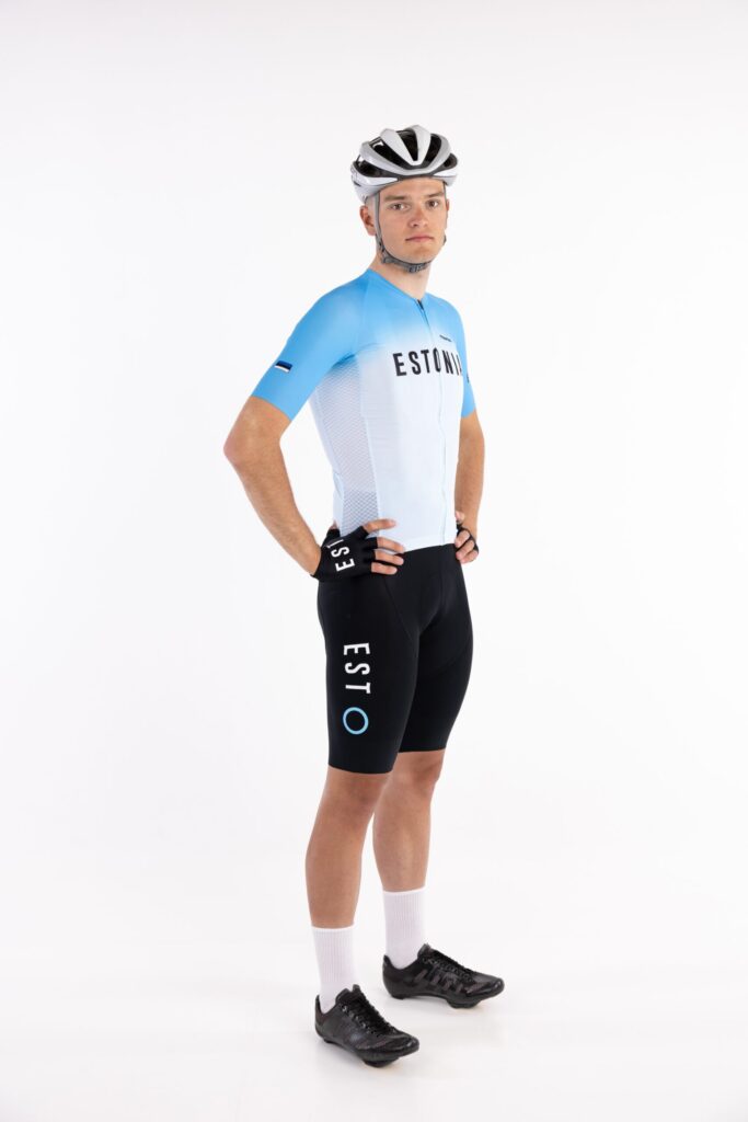
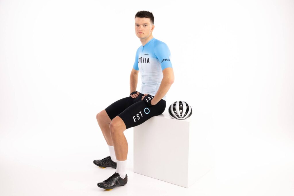
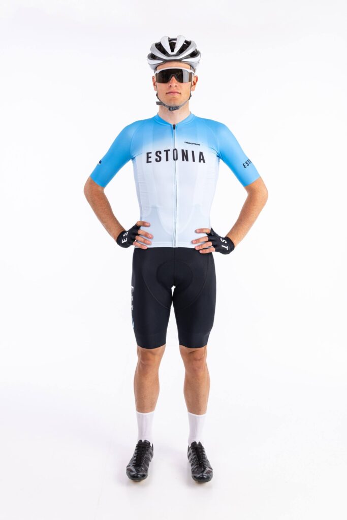
The design process for the Tokyo Olympic team kit began all the way back in 2019. We worked together with the Estonian Cyclist Union and quickly concluded our main aim was to create a kit that was easily visible and unique in the peloton of Olympians. This way it would be easy for fans to spot their riders on the TV set and for team staff on the side of the road to spot their riders. Japan in the summer is a very warm and humid place, due to this we had to take climatic conditions into account. So, we decided to use a lighter shade of blue than we usually are using, this lighter shade helps keep the body from overheating under the warm sun.

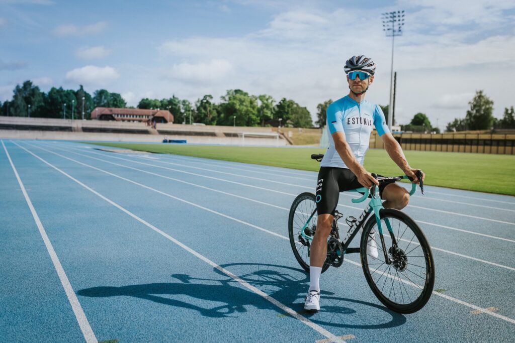
Tanel Kangert, on Track for the 2020 Olympic Games
Next, we started to create a concept – We researched the design of other team kits and of the values of the Olympic Games, and the importance it brings this year. We broke down the key elements and started to build up a concept from the ideas. Then the pandemic hit and the games were postponed, this added another dimension which we wanted to include into the design.
We decided to take a break from the ‘traditional’ color scheme of blue-black and white and due to our needs for a better heat tolerant jersey we decided instead to replace it with a light blue jersey

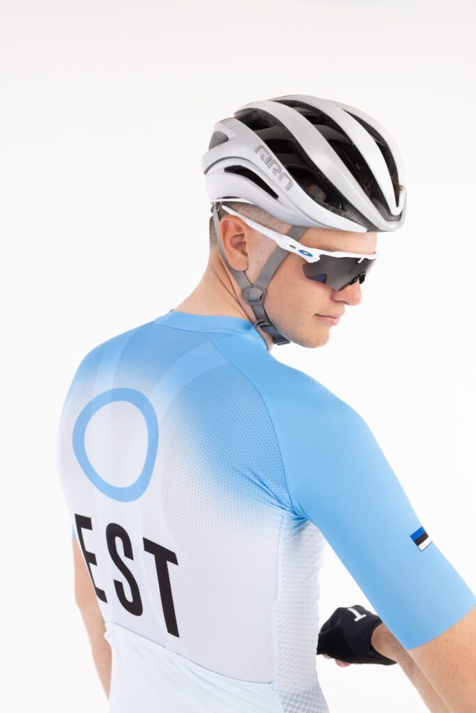
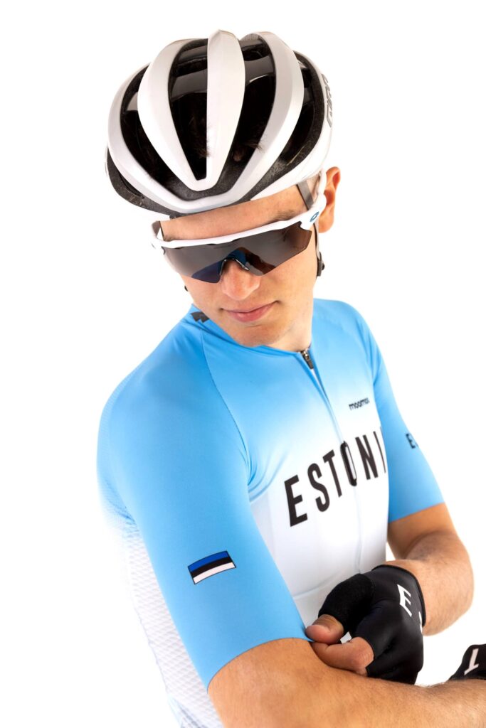
Inspired by both Japan and recent trends in jersey design, the second principle was purity of style and minimalism. Firstly, we believe this is the right style to compete in such a dignified event, and secondly, together with a clever colour scheme and symbolism, we achieve our aims with clarity and uniqueness.
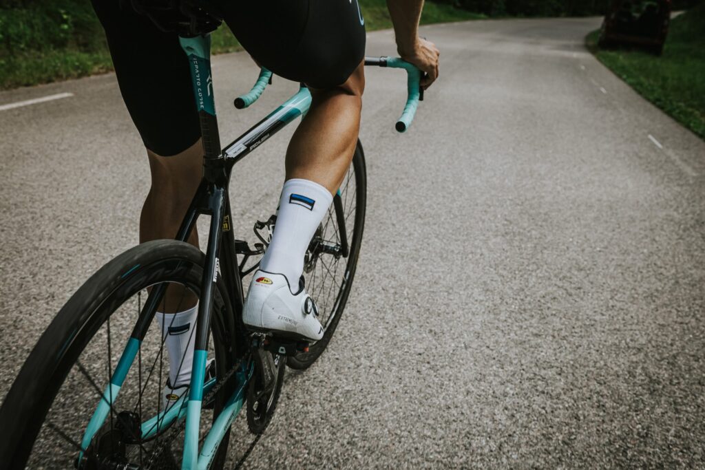
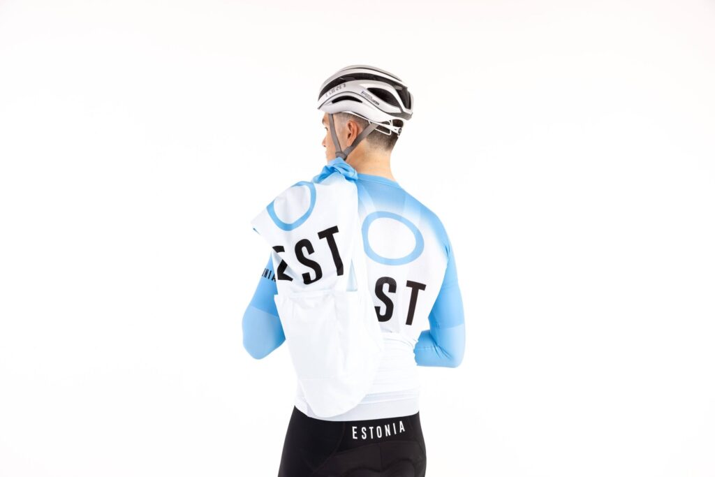
The kit features the national blue circle motif, which carries with it a message of unity and progress that is especially important today. Of course, the circle is also related to the Olympic Games and the core values of Olympism which we hope our design embodies as well carrying the success for the national team. Black bib-shorts complete the design giving a nod to the classic cycling team kits of the past.
All photography by Adam Illingworth.